A virtual hair color try on can clarify whether you want lighter, darker, cooler or more vivid hair. Use a steady photo and compare one change at a time before taking a shortlist to a salon.
Take a photograph that leaves the hair and face readable
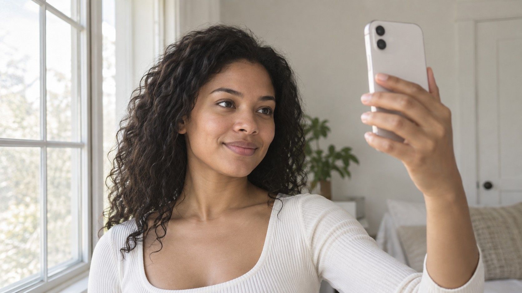
Start near a window in indirect daylight, with indoor lamps switched off if they add a different color cast. Face the light without standing in a direct shaft of sun. You want enough detail to see the roots, parting and ends, with neither side of the face disappearing into shadow. Use a plain background that is visibly different from your hair so the boundary is easier to inspect after an edit.
Keep the camera around eye level and include the entire hair shape. A crop that removes the top of the head can make a darker root hard to judge, while a very close selfie can exaggerate the face relative to the hair. Wear your usual parting and a simple top. If you often wear the hair tied back, take a second reference in that arrangement rather than relying on a styled photograph that represents a rare occasion.
Turn off beauty filters and avoid a photo that already has a strong color edit. Keep an untouched copy so you can compare the face and background later. Before uploading, check the tool's photo handling and deletion options and avoid including other people or personal documents in the frame. A useful picture need not be an elaborate portrait; it needs to show what you are comparing without extra changes doing the persuading.
Compare lightness before getting lost in shade names
Begin with three broad versions: close to your present depth, a little lighter and a little darker. Keep the color family similar at first. This lets you judge value, meaning how light or dark the hair appears, without changing several variables at once. A pale copper and a deep ash brown may both look interesting, but comparing them directly does not tell you whether you prefer the depth or the color direction.
Look at the frame around the face. Does a darker version give the definition you want beside the brows and eyes? Does a lighter version create a softer boundary, or does it remove depth you liked? There is no required answer. A strong outline may suit the mood of one look, while a quieter one may feel easier for everyday clothing. Record the visible effect instead of trying to prove a seasonal category from it.
| Comparison round | Keep similar | Change deliberately | What to note |
|---|---|---|---|
| Depth | General color family | Lightness or darkness | The amount of definition around the face |
| Tone | Apparent depth | Cooler, neutral or warmer direction | The reflection you prefer in the same photo |
| Intensity | Depth and general hue | Muted versus more vivid color | Whether the color becomes the main focus |
| Placement | The broad shade choice | Root depth and lighter sections | Whether the pattern fits your usual hairstyle |
Save a small set after each round rather than keeping every edit. Three nearly identical browns can be useful if you can explain the difference. Twenty dramatic alternatives usually make the decision less clear. Names such as chocolate, beige and mushroom vary between products and tools, so keep the image together with your own short description of the quality you liked.
Check whether the tool changed more than your hair
Put the original beside the edited image and look away from the hair first. Compare the skin, lips, eyes and background. If the face becomes brighter, warmer or more heavily made up, your preference may be partly a response to those changes. A virtual hair colour try on is easier to interpret when the rest of the picture stays steady. Discard a version that changes your features too much to make a fair comparison.
Now inspect the hairline, ears, shoulders and spaces between loose strands. A color overlay can spill onto the skin or leave a halo of the old shade. Very dark hair may lose texture after an edit, while very light hair may become a pale block. These rendering problems can make a reasonable color look artificial. They do not establish that the real shade would be wrong for you.
Check the roots and ends separately. If the software paints every area the same color, it cannot show the pattern you might obtain from an actual service. Hair with old color, natural regrowth and lighter sections may not behave uniformly. Keep an appealing edit as a sketch of an effect, then ask a professional how that effect relates to your actual starting point. A convincing picture is still a picture, rather than a prediction.
Try the shortlist with the clothes you reach for most
A new hair color sits beside collars, glasses and jewelry every day. Once you have two or three plausible options, compare them against a plain light top and a medium or dark top that you regularly wear. Ideally use separate original photographs taken in similar light, applying the same chosen direction to each. Avoid changing the outfit digitally at the same time, because another imperfect edit adds uncertainty.
Notice whether a shade works with the overall contrast you enjoy. A very dark hair edit beside a pale collar can produce a bold frame, while a medium-depth edit may look more continuous with the outfit. Hue and chroma matter too: a vivid red can draw attention even if its lightness is close to your original brown. State which effect you want before describing a version as better.
Include your normal glasses and usual makeup in at least one comparison. If you only like an edit with a heavily styled face that you would rarely recreate, that is useful information before a salon appointment. You may still choose the color, but you will understand the context of the preference. The aim is to recognize yourself in an ordinary outfit, rather than optimize a single flattering screen image.
Use a small shortlist to explain the result at a consultation
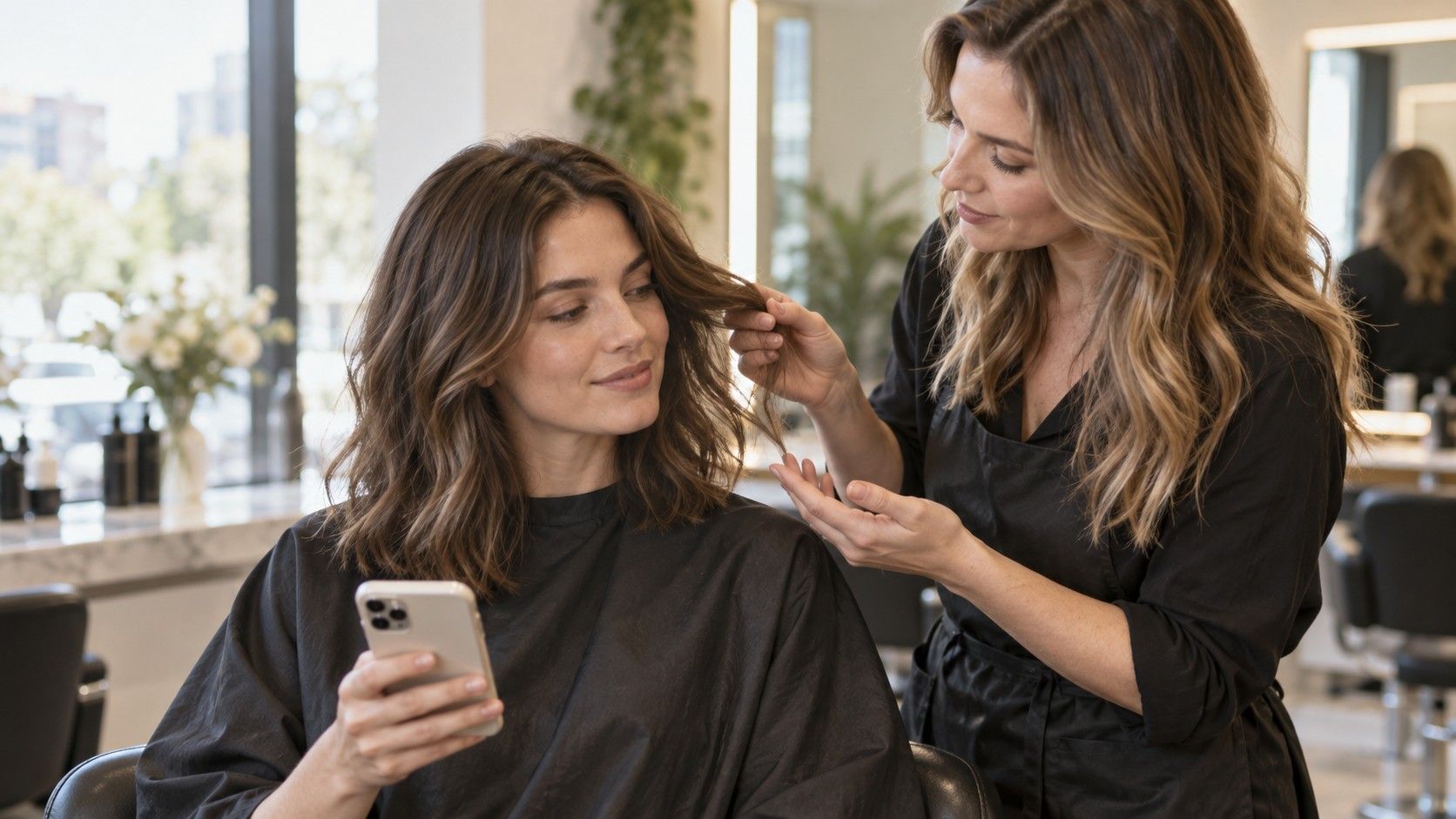
Bring the untouched photo, two or three chosen edits and one example that goes too far in the direction you do not want. Add simple notes: “keep this root depth,” “less yellow in the lighter pieces,” or “this red feels too vivid.” These observations give a colorist something concrete to discuss. A shade label or a season name alone leaves the depth, placement and finish unresolved.
Explain your color history, including home color and any treatments you cannot identify. Ask which parts of the image are realistic from your current hair and which would need a different plan. A virtual overlay does not model every step between your starting point and the pictured result. It also does not assess the hair in person. The consultation should turn the visual direction into a suitable service, with room for an alternative.
Discuss the months after the appointment as well as the first photograph. Say how often you are willing to return, whether you want roots to blend gently and how you normally style your hair. Ask what changes to expect between visits without assuming a particular technique guarantees low maintenance. Follow professional advice and the manufacturer's instructions for any product used, including the checks specified for that product. The edit does not supply those instructions.
Stop when you can name the change you want
The best virtual hair color try on for your decision is one that helps you make a clear comparison without hiding its limits. Look for controls that let you keep the same photo, compare versions and inspect the original. You do not need the most dramatic transformation or an enormous shade library. A restrained set of believable options can explain more than a wall of spectacular but unrelated images.
View your shortlist at a normal size on the same screen. A warm display setting, very low brightness or a different phone can change the apparent shade, so avoid treating a tiny on-screen difference as an exact specification. Screenshots are useful reminders of a discussion. They cannot promise how real hair will look in sunlight, at the office or after several washes.
If you keep returning to an option close to your current color, take that preference seriously. You may want a small tonal change, different highlight placement or simply a haircut rather than a major color service. If the alternatives remain tied, a consultation can narrow what is practical before you commit. There is no prize for selecting the biggest visible change.
A good stopping point is one sentence you can explain without opening the app: “I want a slightly cooler brown at about this depth, with some lighter movement through the ends.” Keep the pictures to support that sentence and leave room for the professional to respond to your real hair. That is where a virtual comparison earns its place: it makes the conversation more specific while leaving the outcome to be assessed in person.