A color analysis quiz gives you a label, a grid of attractive shades and, sometimes, the sudden feeling that half your wardrobe is wrong. Keep the label in perspective. Seasonal analysis is a styling framework, and a quiz result is a suggestion to test, not a measurement that obliges you to replace anything. The useful question is smaller: which colors would make tomorrow’s outfit easier to put together? Start with the actual palette, compare a few familiar clothes in steady light, and let the result earn its place in your shopping decisions.
Read the palette before trusting the season name
Save the palette as well as the season name. “Summer” or “Autumn” can sound descriptive while leaving you unsure what to pick from a shop rail. Look across the swatches instead. Are most pale or deep? Are the brighter colors clear and vivid, or softened toward grey and brown? Do the neutrals lean toward cool grey and navy, or toward cream, camel and warm brown? Those patterns offer something you can compare with a real garment.
A seasonal color analysis quiz may use four seasons, twelve subdivisions or another system. Similar names do not guarantee identical palettes. One site’s Soft Summer may include shades another places in a neighboring group. Keep a screenshot with the name of the system so that you can recognize this difference later. A label copied into a notes app without its swatches loses much of the information that made it useful.
Phone swatches also have limits. Screen brightness, display settings and the photograph of a product can change your impression of a shade. Treat the grid as a direction rather than an exact shopping specification. If the palette repeatedly favors muted blue, compare actual muted blue fabrics beside your face. Do not reject a shirt because its online photograph misses a tiny square on your screen.
Before looking at new clothes, choose two colors from the result that you already like. A palette is easier to investigate when it overlaps with your taste. If every recommended shade feels unfamiliar, begin with its neutrals. A grey sweater or brown jacket can reveal a useful preference without asking you to adopt a conspicuous new color at the same time.
Work out whether temperature, depth or softness matters most
Three separate qualities often get bundled into one season name. Hue describes the color family, while temperature in styling refers to a relative warm or cool impression. Value describes lightness and darkness. Chroma describes how vivid or muted a color appears. A shirt can be cool and pale, cool and deep, or warm and muted. “Blue suits me” is therefore less informative than identifying which blue you mean.
Change one quality at a time when you compare clothes. A bright coral top against a dusty navy one changes temperature, value and chroma together. If you prefer the navy, you cannot tell which difference helped. A more useful pair might be two similar mid-depth reds, one warmer and one cooler. Even then, fabric sheen and neckline may affect the overall impression, so keep the comparison modest.
| What the palette suggests | A comparison to try | What to watch for |
|---|---|---|
| Lighter values | A pale and a deep version of a similar color | Whether the deep fabric dominates the outfit |
| Muted chroma | A softened blue and a clear blue of similar depth | Which feels easier beside your face without added styling |
| Cooler temperature | A cooler red and a warmer red in similar fabrics | A repeated preference across several comparisons |
| Stronger contrast | A clear light-dark pairing and a closer tonal pairing | Which balance you prefer in a complete outfit |
These are visual preferences, not skin health tests. Words such as “bright,” “tired” or “washed out” can become vague very quickly. Give yourself a concrete criterion: can you see your face comfortably, do you like the balance, and would you wear the outfit? You do not need to interpret a normal shadow or a patch of redness as evidence that a season is wrong.
Check three pieces you already own before buying anything
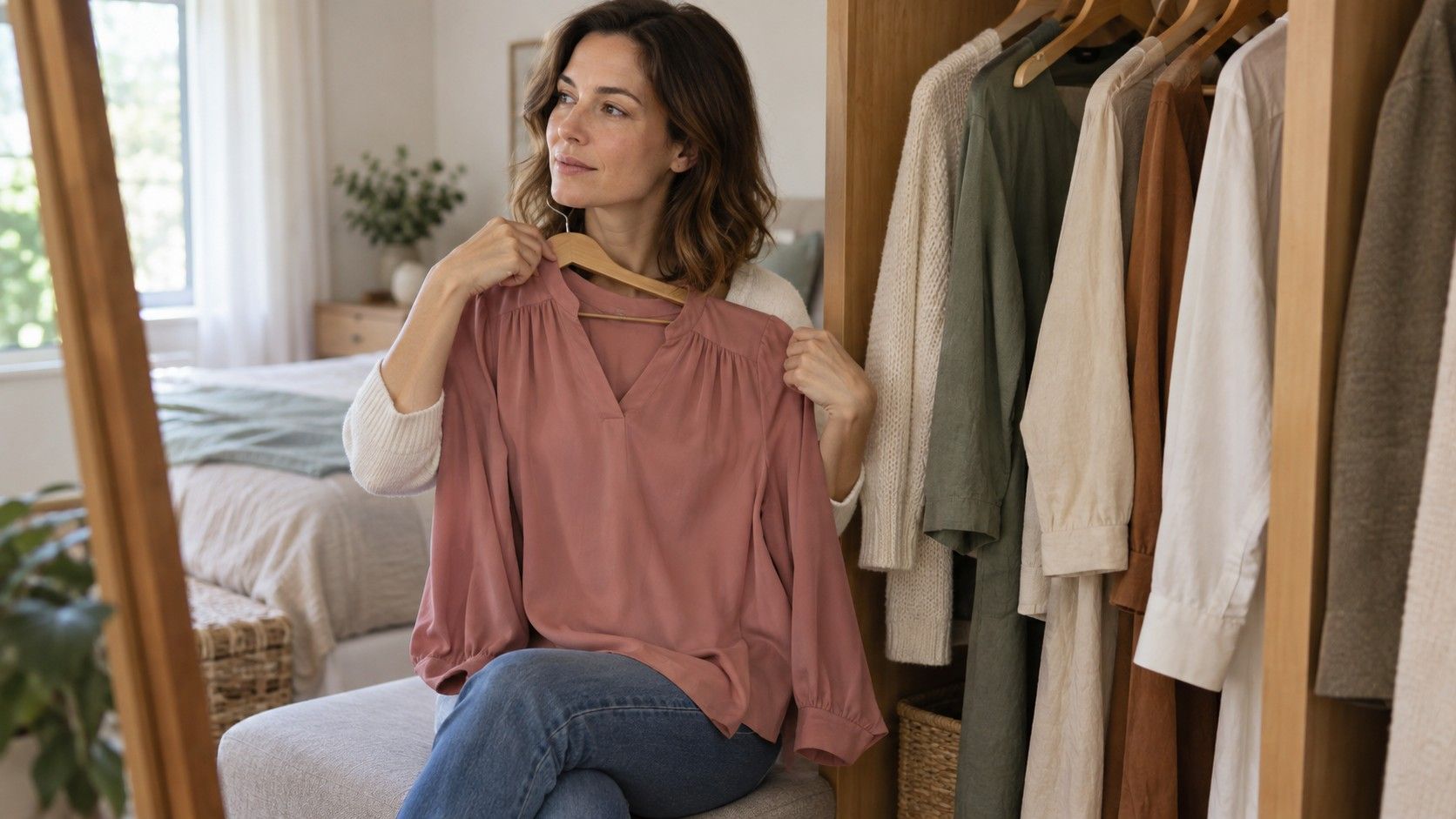
Pull out one dependable favorite, one item you rarely wear and one piece close to the suggested palette. Use garments that can sit near your face, such as tops, scarves or an open jacket. Trousers are useful for building outfits, but they make a less direct comparison when the question concerns color beside your face. Avoid comparing a sequined evening top with a plain cotton T-shirt and attributing the entire difference to color.
Stand near a window in even daylight and switch off nearby lamps if they introduce a different light color. Hold each piece in roughly the same position, with the same background. Do not move from direct sun into shade between items. If you take photographs, keep the camera and framing steady, remembering that a phone may adjust exposure and color automatically as the fabric changes.
Write a short observation for each piece before consulting the season label again. “Easy with my navy jacket” is more useful than “probably correct.” Note whether the neglected item fails because of its color or because the shoulder fit, fabric or neckline annoys you.
Repeat the strongest comparison another day if the difference seems subtle. A consistent preference deserves more weight than one flattering selfie. If the pieces look equally good to you, record that too. An inconclusive test is permission to keep your options open. It does not mean that you have failed to notice some essential rule.
When two quizzes disagree, compare their inputs
One quiz says Deep Autumn; another says Deep Winter. Before deciding which is right, look for their shared message. Both may favor deeper colors while disagreeing about temperature. That makes depth a reasonable starting hypothesis and the warm-cool distinction something to test later. Two neighboring results can be more useful than a single label when you read the overlap carefully.
Now check what you supplied. Did you answer about your natural hair color in one quiz and your current dyed shade in another? Was one based on a photograph taken under a warm lamp? Did a question force you to choose an eye or skin description that did not quite fit? A questionnaire turns nuanced observations into a few answer boxes. A photo tool adds its own interpretation of lighting and image processing.
If you searched for a color analysis quiz free of charge, you may have tried several sites simply because there was no cost barrier. More results do not automatically create a better assessment. Repeating the same uncertain answers across five quizzes can repeat the same uncertainty. Keep two or three plausible results, write down the common qualities, and move to real fabric comparisons rather than gathering labels indefinitely.
A large disagreement is a reason to slow down. If one result recommends pale, softened colors and another deep, vivid ones, retake the input under more consistent conditions before buying anything on that basis. You can also seek a stylist’s explanation of their method if you want further help. A paid opinion remains an interpretation of a styling system; ask what the comparison shows, not merely which season you have been assigned.
Turn the result into one small shopping rule
Choose a rule narrow enough to use in a fitting room. “Try muted blue before bright blue for tops” is actionable. “Only wear Soft Summer” leaves too much unexplained and can make ordinary shopping unnecessarily restrictive. The best rule connects a repeated observation with something you actually need, whether that is a work shirt, a coat or a scarf for an existing outfit.
Take a photograph of two outfits you enjoy and a small saved palette when shopping. Use them as reminders, then inspect the garment in person when possible. Changing-room light may be warm, cool or uneven, so check whether the shop has a suitable area with daylight. Ask about the return policy before relying on a purchase as a home comparison; a return is only an option under the seller’s actual conditions.
Keep colors you love even when they sit outside the result. Their placement can change the outfit: a favorite orange may work as a bag, a skirt or a small patterned detail if you prefer a different shade near your face. That is an option, not a requirement to hide it. Personal taste, comfort and the clothes you already own deserve a place alongside any seasonal guidance.
After a few weeks, review what changed. Did the rule help you choose a useful item or repeat a combination you liked? Keep that part. If the label added doubt without improving your outfits, set it aside and retain the comparisons that were helpful. A worthwhile result should make getting dressed simpler. The evidence is in the clothes you reach for, not in how completely your wardrobe matches a digital palette.