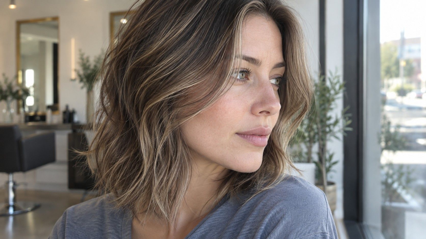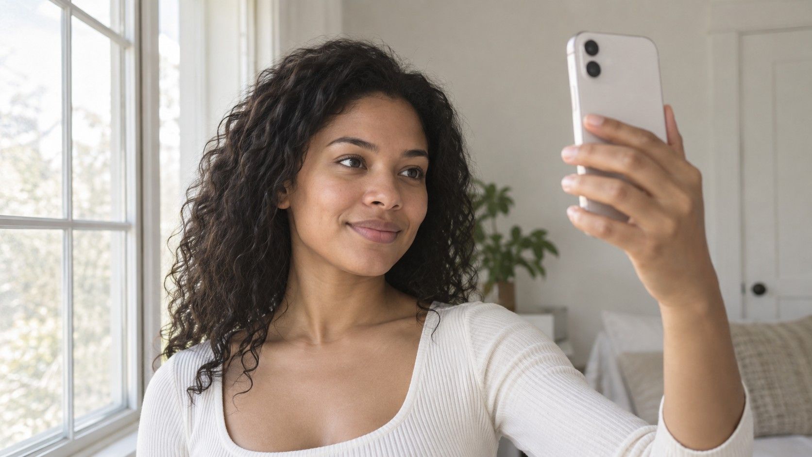
A color analysis photo is an ordinary, clearly lit record of your face, not your most polished portrait. The aim is to reduce the things that can shift how a tool reads color: warm lamps, a tinted filter, deep shadows or a vivid wall reflecting onto your skin. You cannot remove every camera variable, and a careful upload cannot guarantee a correct seasonal label. You can, however, give the comparison a more consistent starting point and know when a result deserves a second look.
Choose a window where the light stays even
Begin beside a window with soft daylight reaching the front of your face. Face toward the window rather than putting it behind you. If direct sun makes you squint or leaves a bright patch across one cheek, move back or wait for softer light. Distance depends on the room and window; the practical check is whether both sides of your face remain visible without harsh highlights or a deep split shadow.
Switch off nearby lamps and overhead lights for the shot if daylight is sufficient. A warm lamp on one side and daylight on the other create mixed light that a camera may not balance consistently. Moving into a dim room to avoid a window is rarely a useful trade. You want enough light for a clear image while keeping the source reasonably consistent.
Look beyond the light itself. A red curtain, green wall or bright garment just below your chin can reflect color onto your face. A plain, subdued background and a neutral top reduce those distractions. There is no need to buy a special backdrop: a suitable wall can work. If the only available wall is strongly colored, change your position so that it is farther from your face, then check the photograph for an obvious cast.
Keep the setup repeatable. Note which window you used and roughly when you took the picture. The same clock time will not promise identical weather or daylight, but a simple record is more useful than comparing an evening bathroom selfie with a cloudy morning portrait. If a color analysis test photo needs a retake, you will have a clear place to begin.
Keep skin visible without trying to make it perfect
Follow the chosen service’s instructions first. If it asks for a bare face, remove foundation, tinted moisturizer, blush, bronzer and colored lip products before taking the photo. These deliberately alter visible color. A sheer product can still matter to the image, even if you would normally describe your makeup as natural. Avoid digitally removing blemishes or evening the skin afterward, because that replaces the record with an edited version.
Normal skin texture, freckles and unevenness do not need to be corrected for the camera. Color analysis is a styling exercise rather than an assessment of skin health. If you have temporary redness after rubbing your face or removing makeup, wait until your skin feels settled before photographing it. There is no universal waiting time that suits every person or every circumstance; look for your ordinary appearance rather than a specified number of minutes.
Move hair away from the cheeks if the service requests a clear view of the face. If your hair is dyed, record that fact where the tool allows it, or keep a private note alongside the result. Some methods consider natural coloring and some assess your current overall appearance. Do not silently switch between those aims when comparing two tools. A major change in visible hair color may influence the image even though your underlying skin has not changed.
Remove tinted glasses and large colored accessories for a neutral baseline. Everyday glasses, makeup and jewelry can be considered later when building outfits. The initial photograph simply keeps the number of competing variables small.
Control the camera before taking the shot
Clean the lens and use the normal camera mode. Turn off beauty effects, portrait filters and any option that visibly changes skin tone or texture. Some phones retain settings from an earlier session, so check the preview instead of assuming the camera has reset. A flattering effect can be subtle enough to overlook while still changing the colors you intended to submit.
Position the camera around eye level and keep a comfortable distance that shows the full face clearly. A very close wide-angle selfie can distort proportions, while a distant crop may leave too few details for the upload requirements. Follow the tool’s framing example if it provides one. Use a timer or a stable support if that helps you hold the same position without tilting your head toward the screen.
Look at exposure before taking several images. If the forehead or cheeks appear as blank bright patches, reduce the exposure or change your position. If the whole face is dark because the window fills the background, turn around and face the light. Do not brighten a severely dark photograph afterward and assume the original color information has been recovered.
Automatic white balance and exposure can still shift between pictures. If your camera offers a simple exposure lock and you know how to use it, it may help keep a short sequence consistent. Manual controls are optional, not a prerequisite for this task. Avoid changing unfamiliar color settings solely because a tutorial recommends a number; the useful goal is a natural-looking, repeatable image, not a technically impressive setup.
Choose between two usable shots without picking the prettiest
Take a small set in the same position, then compare them before uploading. Keep your expression relaxed and your face visible. Choose the photograph with the clearest, most even light rather than the one with the smoothest-looking skin. A shot with a flattering angle but one shadowed cheek makes a weaker baseline than a straightforward image you would never choose for a profile picture.
| What you see | Likely next step | Reason for the choice |
|---|---|---|
| Both cheeks visible, clear detail, no obvious cast | Keep as a baseline | Fewer lighting distractions complicate the comparison |
| One cheek orange and the other cooler | Remove mixed lighting and retake | Different light sources may be affecting each side |
| Bright areas have lost visible detail | Adjust exposure or move out of direct sun | Editing brightness later cannot restore missing detail reliably |
| Skin looks unusually smooth or tinted | Check filters and camera effects | Processing may have changed the intended subject |
| Sharp face but distracting colored reflection | Move the nearby colored surface and retake | A clear image can still carry a misleading color cast |
View the files on the same screen with the same brightness setting. Night-time display modes and other screen adjustments can change your impression of warmth, so do not compare one image on a warm-tinted phone and another on a different laptop. This does not calibrate the display or establish a true skin color. It simply removes an avoidable difference from your own selection process.
Use the original camera file if the service accepts it, within its stated size and format limits. A screenshot or a copy passed through a messaging app may introduce cropping or compression. Do not enlarge a tiny image to meet a pixel requirement and expect more real detail. If the original does not fit the service’s instructions, retaking it is often clearer than repeatedly modifying a poor file.
Retake with one change when the result feels unstable
Suppose the same service returns different seasons from two photographs taken minutes apart. That does not prove that either result is correct. Compare the files for changes in light, framing, makeup visibility and camera processing. Choose the stronger baseline, then alter one condition if you retake it. Changing room, camera and clothing together makes it difficult to identify what affected the outcome.
Keep a short private note: date, camera, window position, whether makeup was worn and any obvious deviation from the instructions. Repeated labels from similar photographs may show consistency within a tool, but consistency alone does not validate its styling judgment.
If you found a service through a search for color analysis upload photo free, check what happens to the image before submitting it. Read the service’s stated storage, reuse and deletion terms, and distinguish a usable free result from a preview that requires payment to reveal the palette. If those details are unclear, choose whether you are comfortable uploading at all. A questionnaire or a fabric comparison avoids submitting a face photograph.
Finally, take a color analysis quiz photo result back to actual clothing. Compare a few suggested colors near your face in stable light and decide whether the palette helps with outfits you enjoy. The photograph is an input to a styling suggestion, not a final verdict. Once you have a clear, reasonably consistent shot, endless retakes are unlikely to make the wardrobe decision simpler. Save your baseline and spend the next few minutes testing a shirt you already own.