Color analysis for men becomes useful when it answers a small clothing question: which shirt goes under this jacket, which neutral is easiest to repeat, or why does one familiar sweater feel easier to wear than another? You do not need a new wardrobe or a seasonal label to investigate those choices. Compare clothes you already own in steady light, keep fit and fabric in view, and include the beard, hair and glasses you actually wear. Personal color analysis is a styling framework; its suggestions are things to try rather than rules about what a man should look like.
Start with the shirts closest to your face
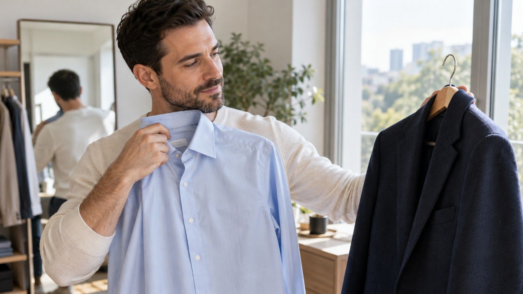
A shirt collar, crew neck or polo sits in a useful position for a color comparison. Trousers matter to an outfit, but a small change at the neck is easier to judge when you are exploring how colors relate to your face. Choose two tops with similar cuts and fabric finishes. A tailored blue shirt and a stretched orange gym top differ in too many ways for color to carry the entire explanation.
Stand facing even daylight, away from direct sun that cuts across one cheek. Switch off nearby lamps if they add a different light color. Hold the shirts at the same height or put them on in turn without moving to another part of the room. A vivid wall or curtain can reflect color, so use a reasonably plain background. You are reducing distractions rather than building a professional studio.
Begin with a favorite and an item you tend to leave in the drawer. Describe what you like before looking at a seasonal chart. Perhaps the favorite creates a comfortable frame around your face, or works with the jacket you wear most. The neglected shirt may fail because of its collar, weight or fit. Pulling at a tight shoulder while judging the color is a clue that another problem deserves attention first.
Keep observations specific and modest. “I prefer this softer blue for an everyday shirt” is useful. “This proves I am a Summer” goes further than a single comparison supports. Take a reminder photograph if you want, but remember that automatic exposure and white balance can shift when a large area of colored fabric enters the frame. Check the real garment as well as the image.
Compare white, cream and grey before adding more colors
Neutrals are a practical place to begin because you may already wear them several times a week. Put a white shirt, a cream or off-white top and a light grey piece together. Look at the cloth first: one white may appear cool and bright, another softer or warmer. A grey can lean blue, green or beige. Retail color names are broad descriptions rather than standardized swatches.
Try each near your face while keeping the visible area similar. If the bright white feels too stark, compare a softer white before concluding that all white is wrong. If cream seems too yellow, try a less warm off-white. A small shift can solve the clothing problem without requiring a whole seasonal theory. Lightness, warmth and clarity are separate qualities, even when a single garment changes all three.
Value describes how light or dark a color is; chroma describes how vivid or muted it appears. Hue is the color family. You can use this vocabulary to explain a preference: a slightly darker grey, a less vivid blue, or a warmer white. That gives you something to look for in a shop even when the retailer calls every option “stone.”
Consider the setting too. A crisp white shirt can make sense with formal tailoring because you enjoy the clear contrast. A softer white T-shirt may be your preference under a casual overshirt. These are different outfit decisions. One neutral need not produce the same effect at a wedding, on a video call and during a relaxed weekend.
Choose jacket contrast with the whole outfit in view
A dark jacket over a pale shirt creates a strong value difference. A medium grey jacket over a muted blue shirt creates a gentler one. Compare these relationships rather than inspecting the jacket alone on a hanger. Button or arrange it as you normally wear it, then look at the amount of shirt visible around the neck and chest. The same jacket can feel different over a T-shirt and a business shirt.
If strong contrast feels distracting, change one layer. Swap bright white for a light blue, or try a medium-depth top under the dark jacket. An abrupt first pairing is no reason to replace a good coat. Conversely, if a tonal outfit seems flat to you, a lighter collar or clearer shirt can create definition without changing every color.
| What you want to compare | Keep fixed | Change first |
|---|---|---|
| Strong versus gentle contrast | The same dark jacket | A pale shirt and a medium-value shirt |
| Warm versus cool neutrals | Similar shirt color and jacket depth | Warm brown and cooler charcoal layers |
| Clear versus softened color | Approximate lightness and shirt cut | A vivid blue and a muted blue |
| Color near the face | The outfit beneath the coat | Two scarf colors in a similar material |
Fabric finish affects the impression. A smooth black blazer, a washed black denim jacket and a charcoal wool cardigan are different propositions even when they look equally dark in a photograph. Use comparisons to choose clothes for your actual routine. A jacket that coordinates with four existing tops may be more valuable than one that closely matches a digital palette but has nothing to go with it.
Include your beard, current hair and glasses
A beard changes the visible frame of the face, particularly when it is dark, red, grey or mixed in color. Compare clothes with the beard you normally wear rather than imagining a clean-shaven version. For an informal wardrobe test, keep your usual facial hair. If you are submitting a photograph to a service, follow its instructions and note facial hair where there is an opportunity to do so.
Wear your everyday glasses when judging complete outfits. Thick dark frames add a visible dark shape; translucent, metal or lighter frames create a different effect. Try the shirt comparison once with your usual glasses and, if comfortable, once without them. The point is to notice whether the frame changes your preference, not to treat glasses as something that must match a seasonal label.
If you are buying new frames, check comfort, fit and visibility before color. Then compare a few plausible finishes in consistent light. Gold and silver jewelry tests do not provide a universal undertone answer, and the same caution applies to metal frames. A frame’s thickness, shape and reflections can matter as much to the overall impression as whether its finish leans warm or cool.
Build a five-piece test from your existing wardrobe
Choose five pieces with specific jobs: a familiar neutral shirt, an alternative neutral shirt, a colored top, a jacket and a sweater or overshirt. Keep the selection small enough to compare without turning the room into a clothes pile. Ideally, each piece should fit well and be in wearable condition so that obvious construction problems do not dominate the decision.
Start with both neutral shirts under the same jacket. Next, put the colored top under it. Finally, use the sweater or overshirt with the better neutral. You now have a handful of real combinations rather than disconnected swatches. Write down which you would happily repeat and where you would wear them. “Good for the office” or “easy with my usual jeans” connects color to an actual use.
Searches for color analysis men often lead to charts based on hair and eye combinations. Use those as possible directions if you find them helpful, but do not let a resemblance overrule the clothes in front of you. Eye color, skin depth and ethnicity cannot assign a reliable wardrobe rule on their own. A quiz suggestion still needs a practical comparison, especially if its questions did not describe your features comfortably.
If the test suggests a useful gap, buy one item that connects existing pieces. A muted blue shirt may make the jacket and sweater easier to wear together; a warmer neutral could suit the brown outerwear you already use. Inspect color in person when possible, or check the seller’s return conditions before relying on a home comparison. Online photographs are imperfect guides to subtle shade differences.
Keep the pieces you like even when a palette disagrees. You can change the layer near your face, use a stronger color in a smaller area, or wear the outfit because it suits your taste. Review the experiment after ordinary use: did getting dressed become easier, and did the new combination stay in rotation? Those answers are more useful than achieving perfect agreement with a seasonal chart.