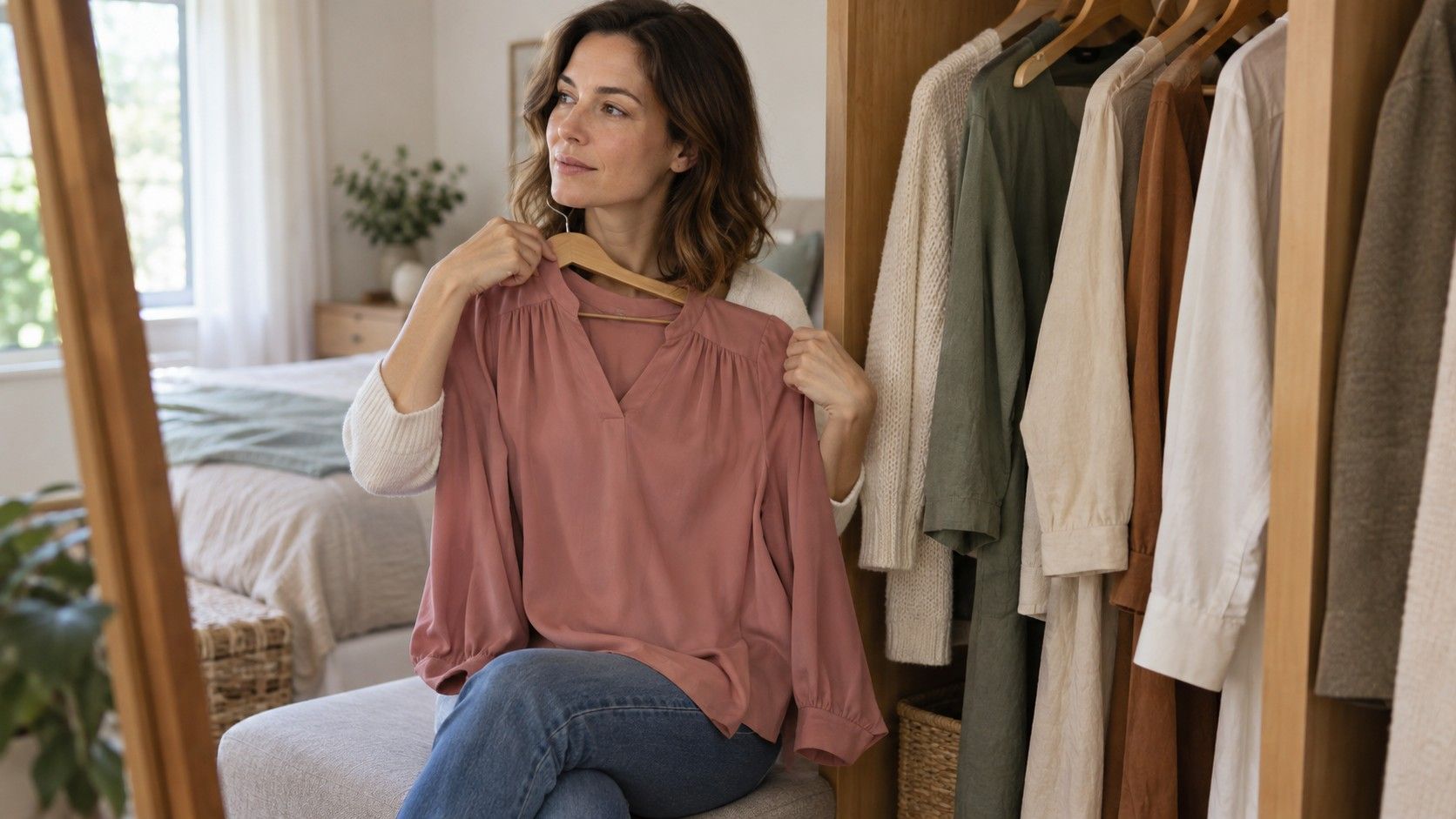
Soft Summer and Soft Autumn can look almost identical on a small palette graphic: dusty pinks, gentle greens, quiet blues and several shades of taupe. The overlap is why a single sage top rarely settles the question. In many twelve-season approaches both groups emphasize muted color, while Soft Summer leans cooler and Soft Autumn leans warmer. I would keep that shared softness steady and compare temperature carefully, using real fabrics in consistent light. The aim is a useful wardrobe direction, with room for uncertainty where the differences remain slight.
Keep softness steady while you compare warmth
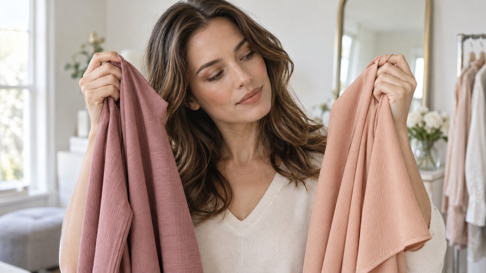
The Soft Summer vs Soft Autumn question becomes muddled when a cool, muted fabric is compared with a very bright warm one. If you favor the muted option, softness may explain the preference. Choose two fabrics that are reasonably close in lightness and saturation before asking about warmth. A dusty rose and a muted peach make a more informative pair than icy pink and brilliant orange.
These seasonal names come from styling systems, and specific palettes vary. Soft Summer is often described as cool-neutral and muted; Soft Autumn as warm-neutral and muted. Neither description means that every swatch is equally cool or warm, or that the palette contains only pale colors. Look at the particular method's examples instead of treating a borrowed diagram as a universal standard.
Set up beside a window with indirect daylight on the face. Avoid direct sun, colored lamps and a strongly colored wall reflecting onto the fabrics. Wear a plain top and hold each drape under the chin in the same position. If hair color is strongly altered, loosely covering it may help you focus on the comparison, provided the covering itself is neutral and does not change between swaps.
Observe the whole composition before inspecting individual features. Do you prefer one color's balance with the face? Does the fabric dominate your attention? Would you enjoy wearing it without special styling? These are aesthetic judgments, and a subtle result can stay subtle. Several consistent preferences matter more than a single dramatic interpretation of a shadow.
Try dusty rose and muted peach without changing everything else
A cool-leaning dusty rose and a warmer muted peach are useful starting examples because their difference is easy to describe. Choose versions of similar depth, and check the actual cloth in daylight. A peach that is almost cream beside a medium rose makes lightness another major variable. A fluorescent coral will make brightness part of the comparison too.
Swap the fabrics a few times and record a plain observation. “I prefer the rose with no makeup” is useful; “Peach proves I cannot wear warmth” goes further than the evidence. The preference may change with the shade, the neckline or the amount of fabric. Try another pair from a different color family before drawing a broader conclusion.
Muted blue-green and a slightly warmer, yellow-leaning green can provide that second comparison if the fabrics have similar softness. Avoid relying on shop names. Two retailers can call quite different colors sage, and a photograph may shift the green further. Put the garments beside each other before deciding which difference you are actually testing.
Leave strong lipstick and colorful eye makeup out of an initial comparison if you want to focus on the unmade-up face. Later, repeat the test with the makeup you normally wear. A wardrobe must work with daily habits, and a color that suits your usual outfit has practical value even if it is less convincing in a simplified draping setup.
Compare two neutrals you might actually buy
Neutrals often reveal the useful part of this distinction because they occupy large areas of an outfit. Compare a cooler grey-brown with a warmer mushroom or muted camel, keeping depth reasonably close. These names are approximate descriptions. Inspect the fabric: some garments sold as taupe look rosy, some look greenish and some are simply grey.
For a darker option, try a softened navy beside a muted brown rather than pairing black with pale beige. The latter changes several things at once. A navy that is almost black may be too deep for the question you want to ask. Choose pieces that resemble the coats, cardigans or trousers you would wear in ordinary life.
| Comparison | What to keep similar | Useful observation |
|---|---|---|
| Dusty rose and muted peach | Lightness and softness | Whether a cooler or warmer pink feels easier |
| Cool grey-brown and warmer mushroom | Depth, surface and fabric size | Which neutral is more useful near the face |
| Muted navy and softened brown | Overall darkness | Which direction supports the intended outfit |
| Greyish blue-green and warmer muted green | Saturation and lightness | Whether the earlier preference repeats in another family |
Judge the neutral as part of an outfit too. The warmer cardigan may combine better with your shoes and trousers even if the cooler one is a slight favorite on its own. A color analysis result cannot replace this practical check. You are choosing clothes that interact with each other, rather than collecting individual swatches.
If both options work, keep both in consideration. Warm-neutral and cool-neutral labels describe a tendency within a method, not a barrier between two incompatible wardrobes. A small temperature difference may matter less than the comfort, cut and texture of the actual garment. There is little benefit in rejecting a successful coat because its label belongs to a neighboring chart.
Do not let one sage top decide the result
A soft autumn color palette often includes muted greens, but muted greens also appear in Soft Summer palettes. The word sage cannot tell you the undertone, depth or saturation of a particular garment. A green that looks subdued online may arrive much clearer, and warm room lighting can make a cool green look more yellow.
Your response to one garment is also a response to its other qualities. A high neckline places more color close to the face than an open collar. Brushed fabric softens reflections, while a glossy finish catches highlights. A good fit can make an outfit feel so much better that the color receives all the credit. Keep these differences in mind when comparing unrelated tops.
Hair and eye descriptions do not resolve this on their own. Lists of ash-brown hair, hazel eyes or freckles can be tempting shortcuts, but people sharing those features need not prefer the same drapes. Colored contact lenses, hair dye and image processing complicate photographs further. Go back to the actual comparisons instead of searching for a celebrity who resembles you.
If online tests disagree, check whether they received comparable inputs. A warm indoor selfie and a cool window-light photo do not provide the same evidence. Repeating an app result does not establish accuracy either. Use the output as a suggestion for the next fabric comparison, with confidence proportionate to how clearly the real clothes support it.
Build outfits while the seasonal label stays open
Start with colors that appear successful across several comparisons: perhaps a greyed blue, a medium taupe and a muted rose, or a soft teal with a gentle brown. These examples are optional. Choose actual pieces you own and like rather than ordering a complete set from a palette image. Add one warmer and one cooler accent to see which combinations feel more natural.
Keep the overall depth of the outfit in mind. A pale muted top with very dark trousers can create more contrast than you want, even when both colors appear on an approved palette. A medium cardigan may bridge them, or you may prefer the stronger contrast. Test the outfit in the mirror before deciding the season has failed.
Use prints as a practical bridge when you like elements from both groups. A small pattern containing grey-blue and warm brown can connect a cool shirt with warmer accessories. Check the background color and scale as well as the individual shades. A large bright flower on a muted ground may change the impression more than the subtle warm-versus-cool distinction.
Make an expensive decision slowly. Before changing hair color or buying outerwear around a tentative result, collect several outfit observations and consider whether further guidance would answer a specific unresolved question. If you consult an analyst, ask how they compare neighboring palettes and explain uncertainty. A clear process is more valuable than an emphatic label.
Soft Autumn vs Soft Summer can remain an open question while your wardrobe improves. Keep the muted colors that repeatedly work, note any consistent temperature preference and leave space for favorites outside the suggested range. The distinction has earned its place when it makes shopping or combining clothes easier. It does not need to become a rule for every color you wear.