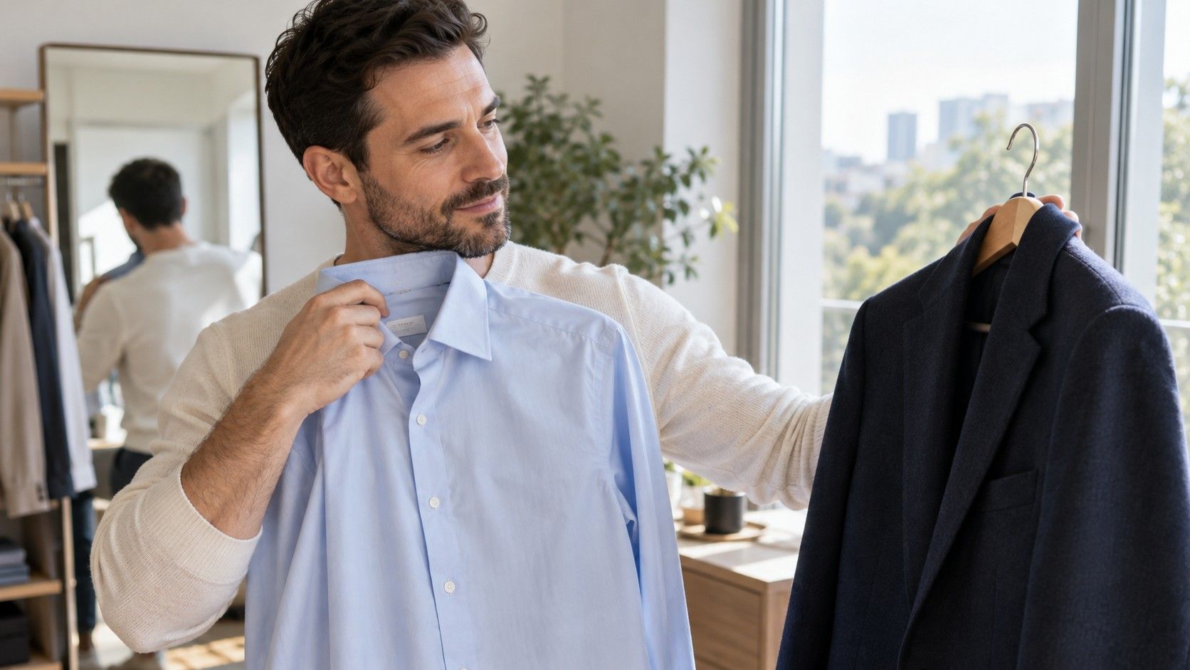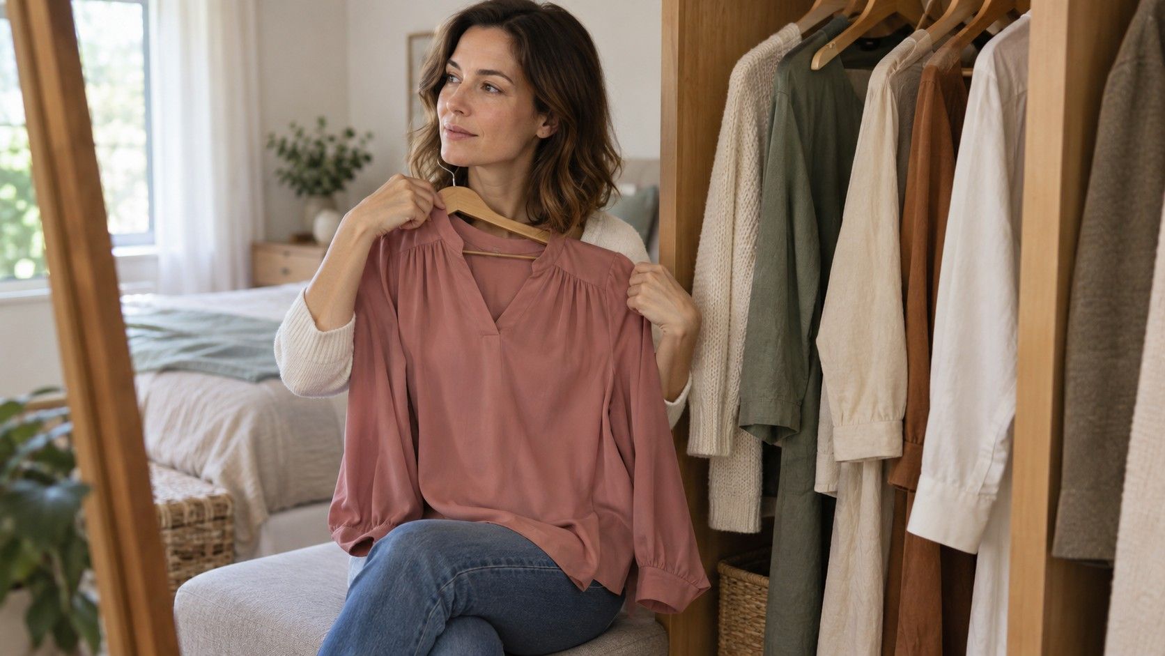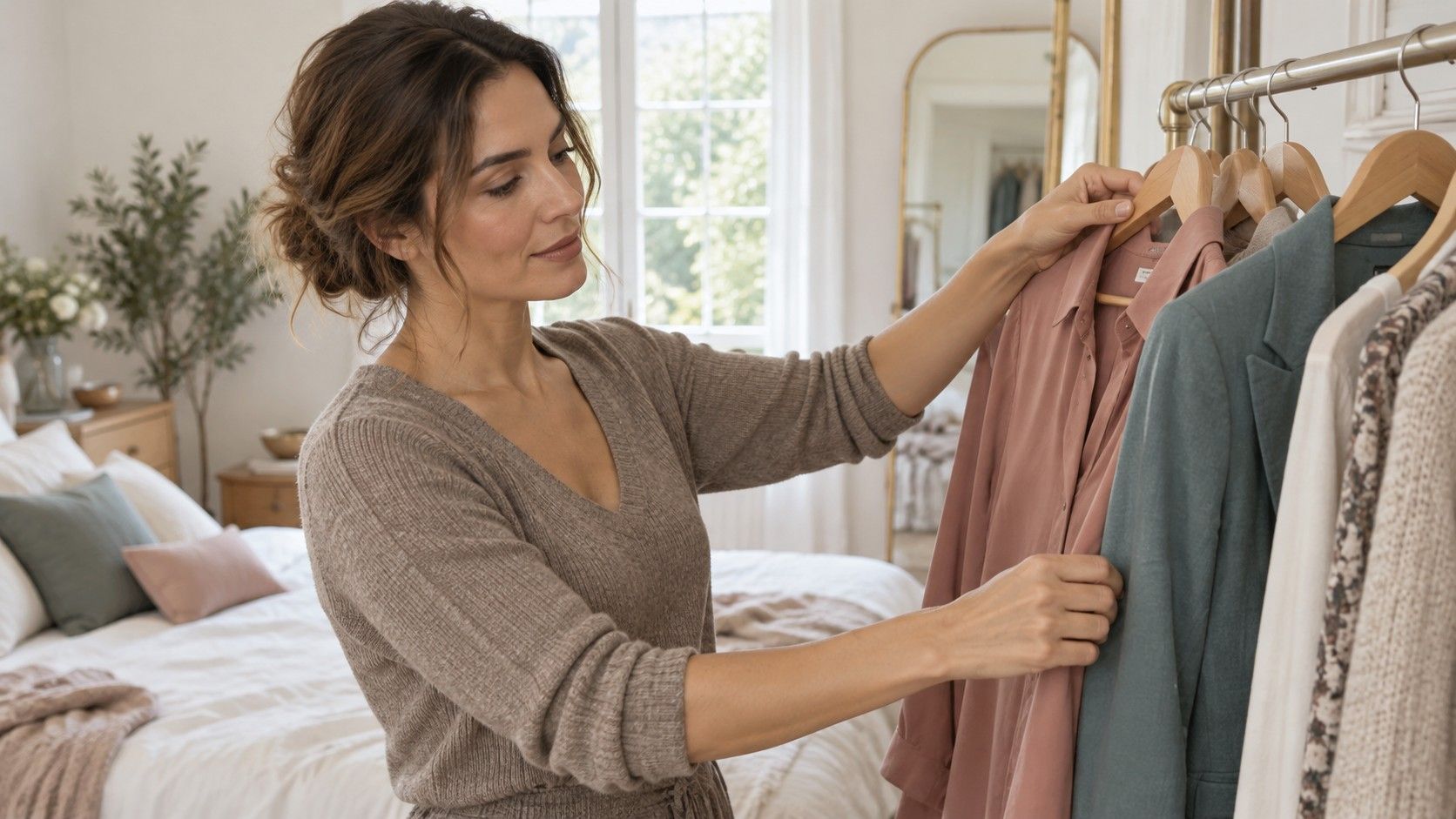
A neutral undertone result can feel less useful than a clear warm or cool label. You may like both silver earrings and a gold chain, yet still struggle with a beige coat in the changing room. I would treat that result as permission to make better comparisons, rather than a claim that every color will work equally well. Temperature is one part of an outfit. Depth, softness, contrast and fabric can explain why two supposedly neutral choices feel very different. Start with clothes you own, and let a few repeatable preferences guide the next purchase.
Treat neutral as a range to explore
In styling, neutral undertone generally describes an appearance that does not seem strongly warm or cool within the method being used. Some approaches describe neutral-warm and neutral-cool tendencies; others use neutral more broadly. Read the explanation attached to your result. The word alone does not tell you which colors were compared or how strongly the system expects you to favor one direction.
This use of neutral is separate from neutral wardrobe colors. A person can have a neutral undertone and enjoy vivid pink, while a muted grey shirt remains a wardrobe neutral regardless of who wears it. Confusing the two can shrink a palette unnecessarily. There is no reason to dress entirely in oatmeal because a quiz selected a middle category.
Nor is neutral a fixed promise about jewelry, foundation or hair dye. Foundation must match the appearance of the skin where it is worn, and product shade labels vary. Clothing is viewed beside the face rather than blended into it. A successful base shade can give you a useful clue, but it cannot assign a complete wardrobe palette on its own.
Write down the question behind your search for neutral undertone colors. Is it choosing a work shirt, finding a dependable jacket or understanding why peach lipstick feels wrong? Keeping that question small prevents an uncertain result from becoming a demand to reorganize everything. A navy jacket that works with your clothes is already useful, even if its seasonal address remains unclear.
Compare neighboring colors before testing opposites
A very pale warm beige beside a deep cool navy changes temperature and depth together. If you prefer the navy, you have not isolated warmth. Start with closer pairs instead: a cool rose and a warmer muted pink of similar lightness, or a greyish blue and a greyish teal of comparable saturation. Real garments will not be perfect laboratory matches, but closer comparisons make the observations easier to explain.
Sit near indirect daylight, with both fabrics below your face and a plain background behind you. Keep overhead warm lights off during the comparison if possible. Swap the fabrics several times while looking in the same mirror. Look at the overall impression and your own preference, rather than searching for one tiny shadow that supposedly proves a rule.
I would describe a result in ordinary language: “I prefer the cooler pink in this light,” or “Both work, but the warmer one suits the brown jacket.” That is more informative than deciding that a single fabric has exposed your true undertone. If one difference is slight and another is obvious, record them with different levels of confidence.
A phone photo can help you remember the garments, but automatic white balance and exposure may change the comparison. A beige wall can also reflect warmth onto skin and fabric. Check the scene directly before relying on a camera preview. If the two options remain equally appealing after several swaps, an equal result is allowed; you can move on to the properties that matter more.
Find the depth and softness that make outfits easier
People often concentrate on warm versus cool while overlooking a stronger preference for medium depth or softer color. Compare a pale blue with a medium blue, then a medium blue with a deeper version. Try to keep their temperature and saturation reasonably close. A preference for the middle option may tell you more about useful shopping choices than another undertone quiz.
Then compare a muted color with a clearer version at a similar value. Dusty teal and bright turquoise are an imperfect but accessible example if both are already in your wardrobe. Notice whether you enjoy the brighter color near your face, prefer it in a smaller area, or find the softer fabric easier to combine. None of these preferences requires a new label.
| Question | A practical comparison | What to avoid concluding |
|---|---|---|
| Warmer or cooler? | Similar-depth rose and warm pink | One preference settles every color family |
| Lighter or deeper? | Two blues with similar warmth and saturation | Black is compulsory if the deeper blue wins |
| Softer or clearer? | Muted teal and clearer teal of similar depth | Every vivid color must leave the wardrobe |
| More or less contrast? | The same top with tonal and contrasting layers | A face must fit one permanent outfit formula |
Contrast deserves its own check. A medium blue top under a similarly deep cardigan creates a different impression from the same top under a pale jacket. If you like both colors separately but dislike the outfit, the relationship between them may be the issue. Try changing the layer before blaming your undertone.
Fabric adds another variable. Shiny satin reflects light differently from brushed cotton, and a loosely knit jumper can appear softer than a flat synthetic top in a similar shade. Compare like with like when possible. If you are shopping for a coat, a paper swatch or a glossy screen color will not fully describe how the fabric behaves.
Build a small wardrobe that mixes temperatures deliberately
Choose two dependable base colors from garments you already enjoy. They might be navy and warm grey, or brown and a softer off-white. These are examples, not a prescribed palette. Put the actual clothes together in daylight and check that you like the relationship. Retail color names such as stone, mushroom and ivory cover a wide range of appearances.
Add two or three accent colors that work with both bases. A muted blue-green may connect a cooler shirt with warmer trousers; a print containing both brown and blue can make the combination feel intentional. A linking color is useful because it repeats something already present in the outfit. It does not need to occupy a perfect neutral midpoint.
Keep warm and cool elements at different scales if an equal split feels awkward. A cool blue shirt with brown shoes is a smaller commitment than a large warm jacket around the face. You can also repeat one temperature in an accessory: a brown belt can relate to the shoes, while the shirt remains the main color near the face.
For neutral undertone colors to wear at work, test the pieces under the lighting where you will actually use them. Window light helps comparisons, but a shirt must still feel right in your office or meeting room. A useful purchase should join several outfits without requiring a special lipstick or a carefully chosen time of day.
Work out why a color only feels right with makeup
Sometimes a top feels comfortable with lipstick but awkward with a bare face. That observation does not automatically make it the wrong temperature. Lip color changes contrast and repeats or balances a hue in the outfit. Blush, eyeliner and foundation can also change the whole impression. Compare the same top with your usual makeup before deciding which variable is doing the work.
Ask how you plan to wear the item. If the shirt is for occasional evenings when you enjoy makeup, its dependence on a particular look may be acceptable. If you want an easy top for early mornings, consider a quieter version, a different neckline or a familiar layer. Practical suitability includes the effort you want to spend getting dressed.
Try moving a difficult color farther from the face. Wear the trousers instead of the high-neck jumper, or leave the jacket open over a top you already like. A smaller area or a visible break of another color can change the effect. This lets you keep a favored garment while testing whether placement matters more than temperature.
Give yourself a short observation period before buying replacements. Keep notes on three outfits you enjoyed, the lighting and the main color properties, without scoring your face or inspecting every photograph. A neutral result becomes useful when it leaves you with a few dependable choices and room to experiment. It need not deliver one final palette that explains every future outfit.