Light Spring and Light Summer palettes share enough pale colors to make a quiz result feel inconclusive. Both can offer soft-looking blues, pinks and light neutrals, yet their usual temperature and clarity differ. The practical task is to find pale shades you enjoy wearing without letting a season name do all the judging. Compare similar light values first, then look at warmth, coolness and vividness. These are conventions for styling, not a scientific diagnosis, and a close result can still produce a useful outfit.
Find a comfortable lightness before choosing a season
A light spring color palette generally favors light colors with a warmer, clearer impression. A light summer color palette generally favors light colors with a cooler, gentler impression. Before investigating that difference, check whether lightness itself helps you. A pale pink and a dark rust change too many qualities at once. Try a light and a medium version of a similar color, using pieces with comparable texture and neckline.
The palest possible shade is not automatically the best one. An almost-white top may feel vague against your face while a light-to-medium blue gives the outfit definition. That does not automatically disprove a light-season result. Palettes contain a range, and the way a garment is cut or layered changes how much color you see.
Use even daylight and a stable position for the comparison. If you take photographs, remember that a large pale shirt can influence automatic camera exposure. A face that appears darker in the photograph may reflect that adjustment rather than a visible effect you noticed in the mirror. Keep the photograph as a reminder and inspect the actual clothes too.
Avoid using blonde hair, light eyes or a fair complexion as an entrance requirement. Those descriptions appear frequently in seasonal illustrations, but matching a model does not establish which fabric you prefer. Equally, having darker features does not prevent you from enjoying light colors. Start from a repeatable clothing comparison rather than deciding whether your appearance fits the picture on a chart.
Compare clear peach with cool pink at a similar depth
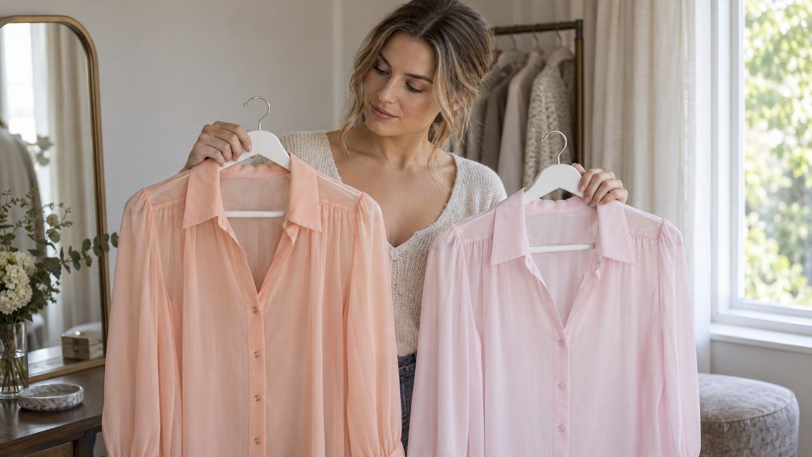
A light peach and a cool light pink make a useful first temperature pair. Choose peach that reads warmer without becoming a strong orange, and pink that leans cooler without becoming a much greyer mauve. The labels on the hangers will not settle this. Place both fabrics together in daylight to see whether their depth and vividness are close enough for the comparison you intend.
Bring one fabric below your chin, then the other, with makeup and accessories kept consistent. Look for a preference you can describe without turning ordinary skin variation into a problem. Perhaps you like the warmer relationship of peach, or find cool pink easier beside your usual hair color. Record the observation in those terms. A subtle preference is still useful; it does not need to become an absolute statement about undertone.
Try another pair before drawing a conclusion. A warmer aqua and a cooler pale blue may support the first impression or complicate it. Keep value fairly similar. A bright turquoise against a misty pale blue mostly demonstrates that the colors differ, not which particular quality caused your preference. If the clothes available are imperfect matches, write down that limitation and use the result cautiously.
People who enjoy both sides do not have to force a winner. A light coral might be a favorite summer top while a cooler pink works well under a grey jacket. You may be responding to fabric, outfit context or the desired effect. The question is whether a warmer or cooler direction makes future choices easier often enough to be worth remembering.
Use pale neutrals without losing the outfit’s edges
Neutrals can clarify a close result because they are easier to repeat in everyday clothes. Try a light warm cream beside a cooler-looking light grey or soft white. These are starting points, not standardized seasonal assignments. Some whites appear yellowish, some greys lean beige, and fabric finish can make either seem brighter. Compare the actual garments rather than shopping by color name alone.
If an all-pale outfit feels indistinct, add definition through one element at a time. A slightly deeper cardigan, a visible neckline or a small repeated color in shoes and accessories can make the combination feel deliberate. You need not jump straight from a pale outfit to a black jacket. Test a medium blue, muted navy or another familiar darker color and decide how much contrast you want.
| Outfit problem | Small change to try | What it can clarify |
|---|---|---|
| A pale top feels too close to your skin | A similar shade one step deeper | Whether value matters more than temperature |
| Cream feels too warm | A comparable soft white or cooler light neutral | Whether the neutral’s temperature affects your preference |
| An outfit looks unfinished | Repeat one mid-depth color in a layer or accessory | Whether a little structure resolves the issue |
| A dark jacket dominates | A lighter or softer version of that neutral | Whether strong value contrast is the difficulty |
Consider the job of the garment. A pale shirt needs to work near your face; pale trousers mainly need to coordinate with the rest of the outfit and suit your practical requirements. A seasonal palette does not answer questions about transparency, easy care or whether you enjoy wearing light trousers on public transport. Those concerns can matter more than a marginal difference between two creams.
Check softness separately from brightness
Light does not mean greyed out, and bright does not necessarily mean dark. Chroma concerns how vivid or softened a color looks, while value concerns its lightness. Light Spring is commonly shown with more clarity than Light Summer, but exact swatches vary between systems. Once you have explored temperature, compare a clearer light color with a softened version in the same general family.
A fresh pale aqua and a greyer pale aqua can reveal this distinction if their lightness is reasonably close. Hold them in the same position and look at the whole relationship with your face. If the clearer shade draws more attention, decide whether you enjoy that effect. A color being noticeable is not automatically a failure; sometimes the purpose of the outfit is to make the color visible.
Keep faded fabric out of the role of an unquestioned “soft” swatch. A worn T-shirt may also have lost shape, become uneven in color or developed a different surface. Comparing it with a crisp new blouse introduces several advantages for the blouse. Use similarly finished pieces when possible, or acknowledge the difference instead of describing your response as a precise seasonal test.
A true spring color palette may appear beside Light Spring in search results, but those names are not interchangeable. In common twelve-season descriptions, True Spring emphasizes warmth more centrally, while Light Spring emphasizes lightness. There are variations in terminology, so check the actual chart you are using. Do not borrow a much stronger warm shade from another palette and treat your reaction as a verdict on every Spring color.
Turn a close result into outfits you can repeat
Choose two or three observations that survived more than one comparison. You might prefer light-to-medium values, slightly cooler pinks and a little softness. That sentence is more useful in a fitting room than a label alone. Keep a small palette image if it helps, but add photographs of clothes you already like so the note reflects your wardrobe rather than an idealized grid.
Build one outfit around a familiar neutral and one pale color. For example, try an existing light grey cardigan with cool pink, or cream knitwear with a warmer peach. These examples illustrate temperature relationships rather than universal recipes. Add your usual shoes and bag before deciding whether the outfit works. A color that looks convincing at the mirror still has to fit the way you get dressed.
If you want to buy something, choose an item that fills a real gap. A light scarf can be an easy comparison, but it is a poor purchase if you never wear scarves. A shirt you need for work may be a better test. Check the shade in person when possible, because online images and display settings can make pale colors look unusually white or hide a slight warm cast.
Keep colors that make you happy, including stronger ones outside either light palette. Try changing their placement or pairing before deciding they have no role. If your preferred direction remains unclear, use shared light colors and stop testing for a while. A useful comparison should reduce shopping doubt. It has done its job when you can make a few reliable combinations, even if Light Spring and Light Summer remain close neighbors in your notes.