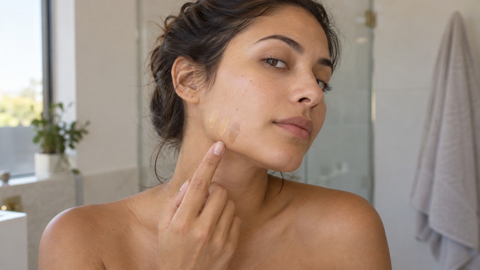
A foundation shade finder can suggest a bottle from one photograph, but the camera has already made decisions about your face before the tool sees it. White balance, exposure and a warm ceiling light can all shift the evidence. I would use a photo result to narrow the samples worth trying, then judge the actual formula on the skin in ordinary light. A useful match involves depth, undertone, coverage and finish together. The aim is a comfortable result across the face and neck, rather than a perfect-looking square on a phone screen.
Take a photograph with fewer color distractions
Follow the shade finder's own framing instructions, then check the lighting around them. Indirect daylight from a window is a practical starting point. Face the light rather than placing the window behind you, and avoid a strip of direct sun across the cheek. Turn off a warm lamp if it creates a second color of light. A bright photograph with mixed lighting can be less informative than a quieter, evenly lit one.
Use a plain background and move away from strongly colored walls or curtains that may reflect onto the face. Keep a bright scarf out of the frame. Remove colored filters and beauty effects, and avoid altering warmth, saturation or skin texture before uploading. The tool cannot recover the original appearance from a photograph that has been deliberately changed.
Even a carefully made photograph remains an approximation. A phone can lighten a darker scene, warm a cool room or smooth differences between areas of the face. If your image makes a familiar neutral wall look orange or blue, treat the color suggestion cautiously. Retake it under simpler light rather than correcting the face with a series of editing sliders.
Use bare skin for the initial photo if the tool asks for it, so an existing foundation does not become the reference color. Later, test the actual sample with your usual skincare and sunscreen, following product directions.
Use the online suggestion to choose samples
A foundation shade finder with photo input may suggest a particular product, a shade family or several candidates. Read which of these it actually provides. A result tied to one formula cannot automatically transfer to another product with the same shade name. Shade codes, labels and ranges can differ between brands and sometimes between formulas within one brand.
Choose a small range around the suggested result if samples are available: the proposed shade, a nearby depth and a nearby undertone. Which neighbors are useful depends on the range. Avoid ordering many full bottles simply because the interface displays confidence. A confident label describes the tool's output; it does not show how the foundation will look after blending or wearing.
Separate a depth mismatch from an undertone mismatch
Depth concerns how light or dark the product appears beside the skin. Undertone labels describe a color direction, often using terms such as warm, cool, neutral, golden, pink or olive. Those terms are brand conventions rather than a consistent scale. A shade can be close in depth yet look too peach, or have a plausible color direction while being noticeably too pale.
Start by asking whether the sample leaves an obvious lighter or darker patch once blended. Then ask whether its color casts pink, orange, yellow or grey beside the surrounding skin. These descriptions are visual notes, not a diagnosis of your skin. One formula may look different because of its pigment mix or coverage, so record the product as well as the shade.
| What you notice | A useful next comparison | What remains uncertain |
|---|---|---|
| The blended area looks too pale | A nearby deeper shade with a similar color direction | Whether coverage or finish also affects the impression |
| Depth seems close, but the patch looks too pink | A similar-depth shade with less visible pink | How the brand defines neutral or warm |
| The product looks distinctly orange | Check depth and undertone separately in daylight | Whether the product changed during wear |
| The color looks close but the face seems very flat | A thinner application or a different finish | Whether the shade itself needs changing |
A seasonal clothing palette cannot select a foundation shade. Soft Summer, warm-neutral and similar styling labels describe relationships between colors and an overall appearance within a method. Foundation must be assessed where it is worn. Skin tone and undertone analysis can help you organize questions, but a palette label cannot replace checking the specific product against the face and neck.
Compare the jaw and neck with the coverage you intend to wear
If a counter offers a hygienic sample process, ask to compare a few narrow swatches near the jaw rather than relying on the back of the hand. The hand may differ from the face in color and exposure. Keep the samples separate, label their order in a note and use fresh applicators or the sample procedure provided. Do not share used personal applicators.
The jaw gives a practical view of the transition between face and neck, but these areas do not always match exactly. Look at both rather than chasing a tiny patch in isolation. If you will wear an open neckline, consider the visible upper chest too. The goal is a result you like across those visible areas, with an application plan that does not create a conspicuous edge.
Blend one promising candidate as you would actually use it. A thick opaque stripe is useful for spotting differences, but it may exaggerate a mismatch compared with a sheer application. Conversely, a very thin sample can hide a difference that becomes clear at full coverage. Test the amount you plan to wear before deciding a shade is close enough.
Step away from the counter's display lighting and inspect the result in indirect daylight where practical. Look directly in a mirror before taking a photograph. If a trip outside is not possible, avoid treating one store mirror as final proof. A sample taken home gives you a chance to assess the formula in the places where you normally get ready and spend the day.
Let the formula settle and check the finish
A foundation can look different after application as its film settles and surface moisture changes. Follow the product's directions and allow time before deciding. Compare the initial appearance with a later check under similar light, rather than placing a fresh swatch beside an older one and assuming every difference comes from shade selection.
People often describe any darkening or warming as oxidation, but the visible change alone does not identify its cause. The product, application amount, skincare, skin oils and lighting can all affect the impression. Record what you actually see and when you see it. “Looks warmer after an hour” is a useful note without a chemical explanation attached.
Finish matters even when the pigment color is close. A luminous base reflects more light than a matte one, and a powder layer may alter the final appearance. Try the foundation with the skincare, sunscreen and setting products you normally use, following their directions. If you change the whole routine for the test, you may approve a result that does not represent daily wear.
Check comfort and appearance after a normal period of wear before committing to a full-size purchase where samples permit. Notice whether the base separates, gathers or emphasizes texture in a way you dislike. Those are formula and application questions as well as shade questions. A different finish may be more useful than moving repeatedly between neighboring colors.
Keep photographs as a shopping record
Use photos to remember the candidates, application and timing. Record the exact formula and shade, the light source and whether the image shows a fresh or settled application. Keep an unedited version if you intend to compare later. Avoid judging two photographs shot in different rooms as though they were a controlled side-by-side test.
A color that looks close on your screen may look different on another display, with a warmer screen setting or under a different room light. The photograph is a reminder of the test rather than a portable color standard. Save a written observation as well: which sample blended most easily, where a visible edge remained and whether the finish suited your usual routine.
A photo shade finder has done a useful job when it reduces the number of samples you need to investigate. The final decision belongs to the actual product, on the skin, after blending and wear. Keep a tentative digital suggestion in that role, and you can use it without asking a selfie to deliver a precision it cannot demonstrate.