A high or low contrast face test can help you choose how much light-dark difference to put near your face. The useful result is a clothing comparison you can repeat in daylight, rather than a permanent label based on one selfie.
Start with the light and dark already around your face
A useful high or low contrast face test begins with relationships. Look at the apparent lightness of your skin, hair, eyebrows and eyes together, rather than judging a single feature. In color terminology, this light-to-dark dimension is called value. A large value gap can create a stronger impression of contrast; a smaller gap can create a quieter one. This is a styling description, with room for a middle range, rather than a fixed identity.
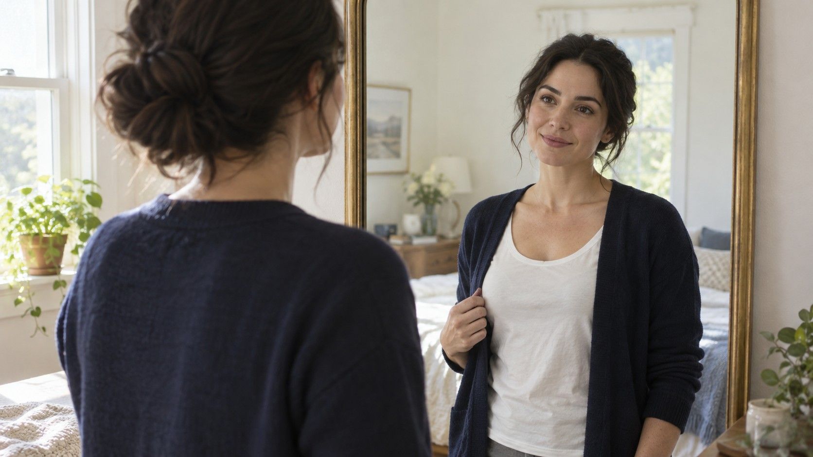
Stand a short distance from a mirror near a window, with your hair arranged as you normally wear it. Remove a hat or bright scarf that takes up much of the view. Notice whether your eye moves between distinctly light and dark areas or reads the face and hair as a more continuous range. A dark eyebrow against lighter skin may be relevant even when your hair is light. Likewise, light eyes do not cancel the effect of dark hair framing the face.
Do a second check with your hair pulled back. If the impression changes, record both versions. Your face does not need a single permanent contrast label to make a clothing decision. The amount of hair visible around a collar, a fringe covering the brows and a dark pair of glasses can all affect the combination you actually dress each morning. Avoid drawing conclusions from ethnicity or a skin-depth category: neither tells you the value relationships of an individual face.
Use grayscale as a cross-check, with the camera kept steady
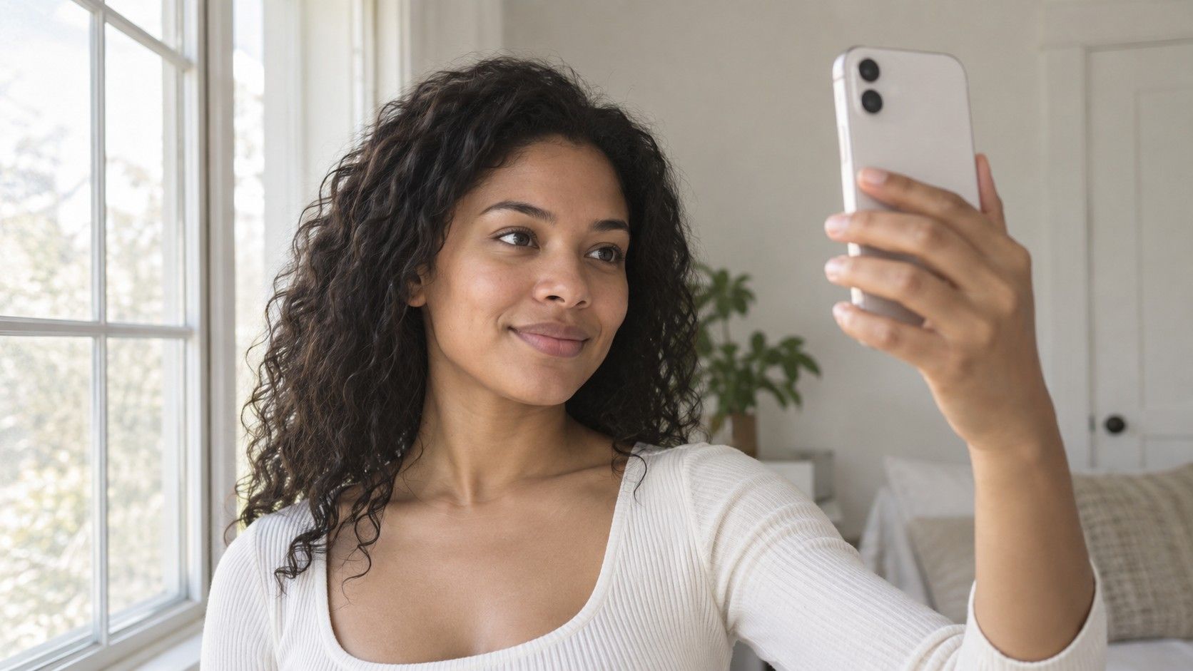
A grayscale photograph can make light and dark easier to compare because it removes much of the distraction of hue. Take one straight-on photograph in soft daylight, away from direct sun and colored walls. Keep the phone at roughly eye level, turn off portrait filters and beauty effects, and use a plain background. A window to one side can throw half the face into shadow; move until the lighting looks reasonably even.
Convert a copy of that one photograph to grayscale. Do not compare a color selfie from the bathroom with a grayscale selfie taken outside. Exposure, angle and light have changed along with the color. Look for broad areas rather than individual bright pixels: the hair mass beside the cheeks, the brows above the eyes and the general face area. Small catchlights in the eyes or a shiny forehead should not decide the result.
The image remains an approximation. Automatic exposure can lighten the skin, deepen the hair or flatten distinctions, and grayscale conversions do not all translate colors in the same way. If the photograph suggests strong contrast but the mirror looks much gentler, treat that disagreement as a reason to test clothes. A face contrast test is most helpful when it leads to a repeatable dressing choice, not when it produces an impressive numerical score with no explanation.
Try three outfits before choosing a contrast level
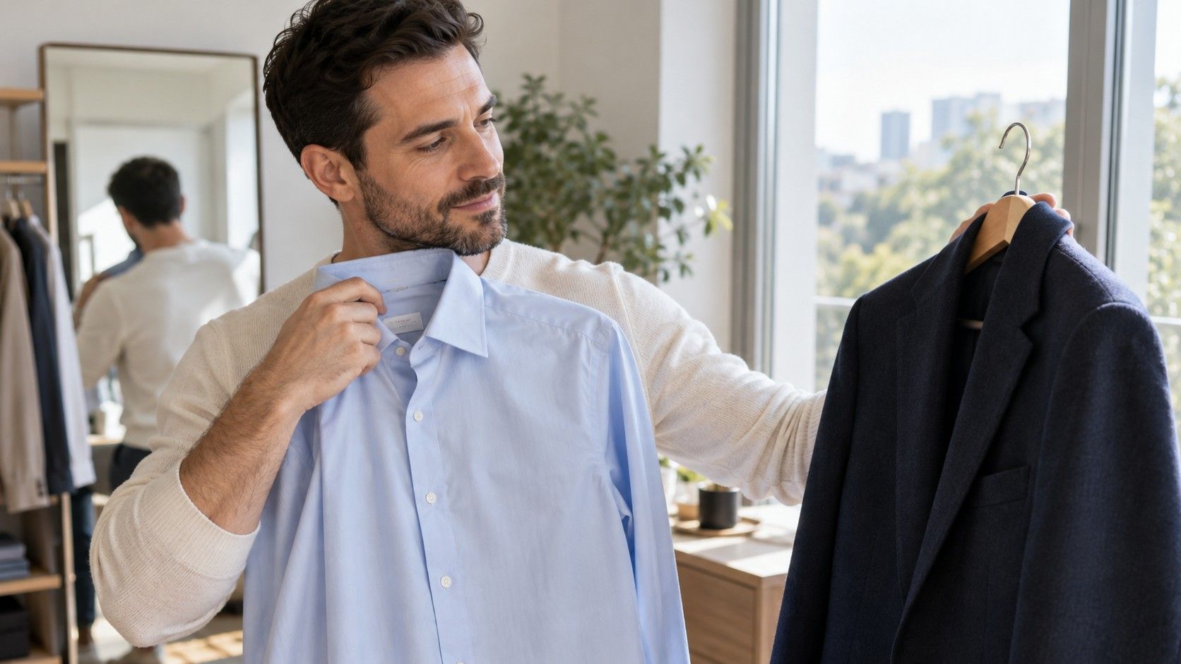
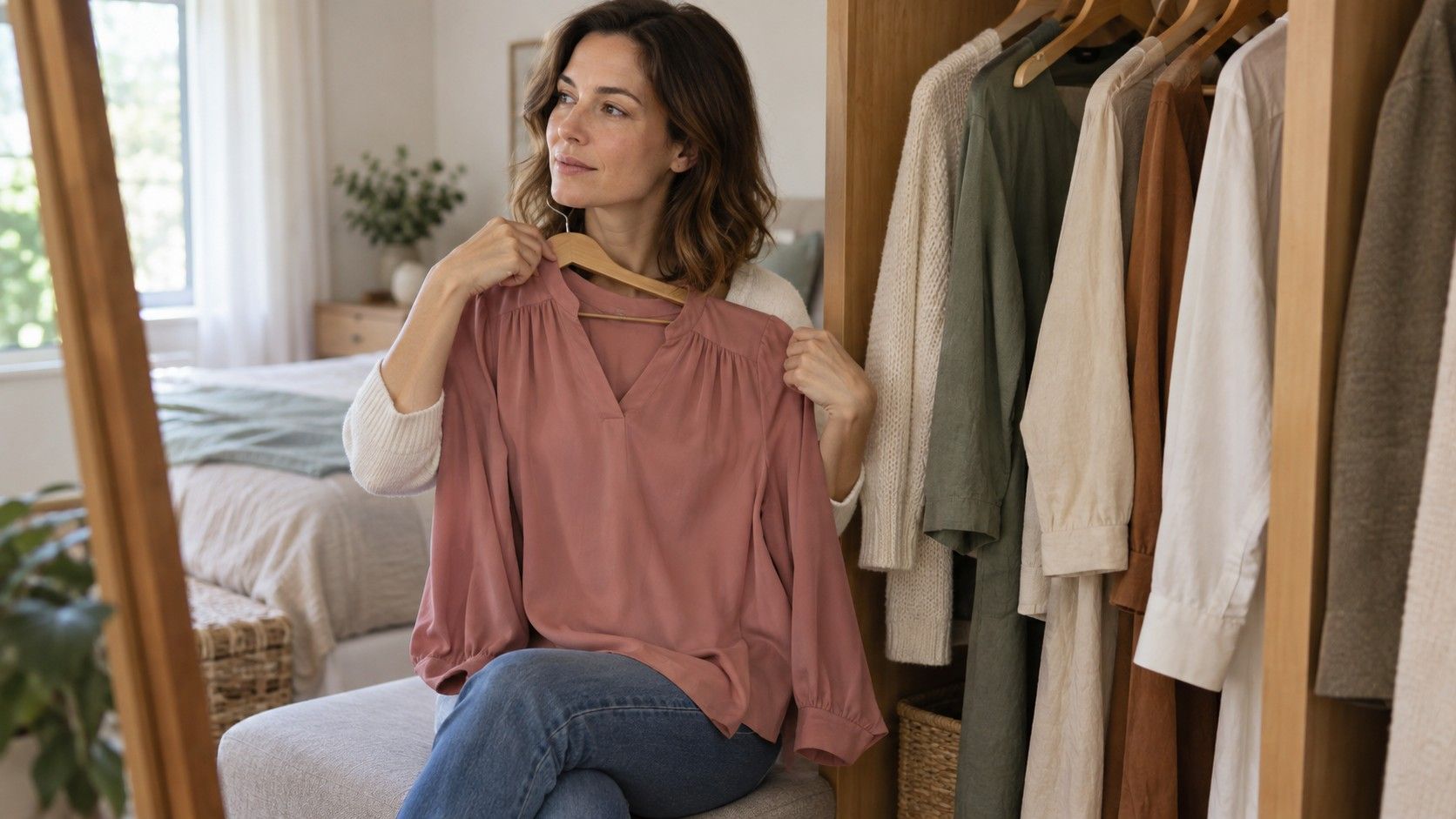
Choose clothes with a similar shape and fabric so the lightness difference does most of the work. A plain T-shirt under the same open jacket is easier to compare than a delicate blouse against a patterned hoodie. Begin with neutrals you already own. Hold each combination near the face in the same mirror, then step back far enough to see the neckline and shoulders.
| Combination | Example to try | Question to ask |
|---|---|---|
| Small value gap | Light gray with a slightly deeper gray | Does the face stay visible, or does the whole view feel too quiet for your aim? |
| Medium value gap | Medium blue with pale gray | Does this create enough definition without a hard dividing line? |
| Large value gap | Very dark navy with a pale top | Do you enjoy the clear structure, or does the neckline pull attention away? |
Keep the questions tied to your purpose. For a restrained portrait, you may want the viewer to notice your expression before the clothes. For a graphic evening outfit, a bold collar may be exactly the point. Neither response means the test failed. Compare the same area of the face each time, such as the eyes and mouth, rather than searching for a general feeling that one outfit makes you a better-looking person.
Change the order and repeat the comparison. The first outfit can feel familiar and the last one can feel exciting simply because it is different. If a combination works consistently, take a reference photo and write a short note such as “medium gap, soft neckline.” That is a more useful wardrobe instruction than “high contrast” alone. You can carry it into a shop without needing every garment to match an assigned season.
Separate a bright color from a strong light-dark gap
Contrast, hue and chroma answer different questions. Hue is the color family, such as blue or orange. Chroma describes how vivid or muted a color appears. Value describes its lightness or darkness. Two highly vivid colors can have similar values, while two subdued neutrals can sit far apart in value. The words bright and strong are often used for all of these effects, which makes outfit advice confusing.
Try a muted dark plum beside a pale stone fabric. The colors may feel quiet individually, yet together they create a substantial light-dark gap. Now compare two medium-value colors, such as a medium green and medium blue. Their hues are different, but a grayscale photograph may show a much smaller value difference. The second outfit can feel colorful without creating the same graphic frame around the face.
Pattern adds another variable. A black-and-white print with tiny marks can blend into gray from across the room, while broad black-and-white stripes remain distinct. Test a print at the distance where people normally see you, then closer to the mirror. If you like high contrast in principle but find a particular print distracting, the scale and placement may be the issue. There is no need to reject every dark-and-light combination because one large check pattern felt busy.
Adjust the result when hair, makeup or glasses change
Hair color can alter the visible frame around the face. If you move from dark hair to a much lighter shade, your old outfit contrast may feel different even though your skin and eyes have not changed. Repeat the same three clothing combinations after a hair change, using comparable daylight. Give yourself time to become familiar with the new appearance before making a costly wardrobe decision from the first mirror check.
Makeup also changes the picture you are evaluating. Dark eyeliner, a defined brow or a deep lip adds darker areas and sharper edges. That can support a more graphic clothing combination if you enjoy the effect. Compare both your usual makeup and a bare-face version only if you regularly dress for both. A test conducted with an elaborate evening look does not have to dictate what you wear on an ordinary morning.
Glasses deserve a separate trial because the frame sits directly on the face. Thick dark frames and nearly transparent ones create different boundaries, even with identical lenses. Put on the pair you intend to wear while checking a collar or scarf. If your result changes with the glasses, keep two simple outfit references rather than trying to prove that one version is the true you.
Keep the result as a wardrobe shortcut, then stop testing
The practical difference in high contrast vs low contrast face advice is the suggested size of the light-dark gap near the face. It does not establish a scientific threshold for what you are allowed to wear. Many people find a medium gap easiest; others enjoy both gentle and dramatic combinations for different occasions. Your preferred effect matters as much as whether the outfit repeats your natural coloring.
Save two or three combinations that you can recreate with real clothes. Note the collar, the amount of pale fabric showing and whether a darker layer frames the shoulders. If a favorite black-and-white outfit feels harsher than you want, try reducing the pale area, opening the neckline or choosing a softer off-white. These are small experiments with what you own, not instructions to replace a whole wardrobe.
Stop when the comparison starts producing tiny, unstable differences. Changes in daylight, mood and camera processing can outweigh them. A useful outcome is being able to say “I prefer this amount of definition today.” If you can make that choice with less hesitation, the test has done its job, whether your notes say low, medium, high or simply “depends on the outfit.”