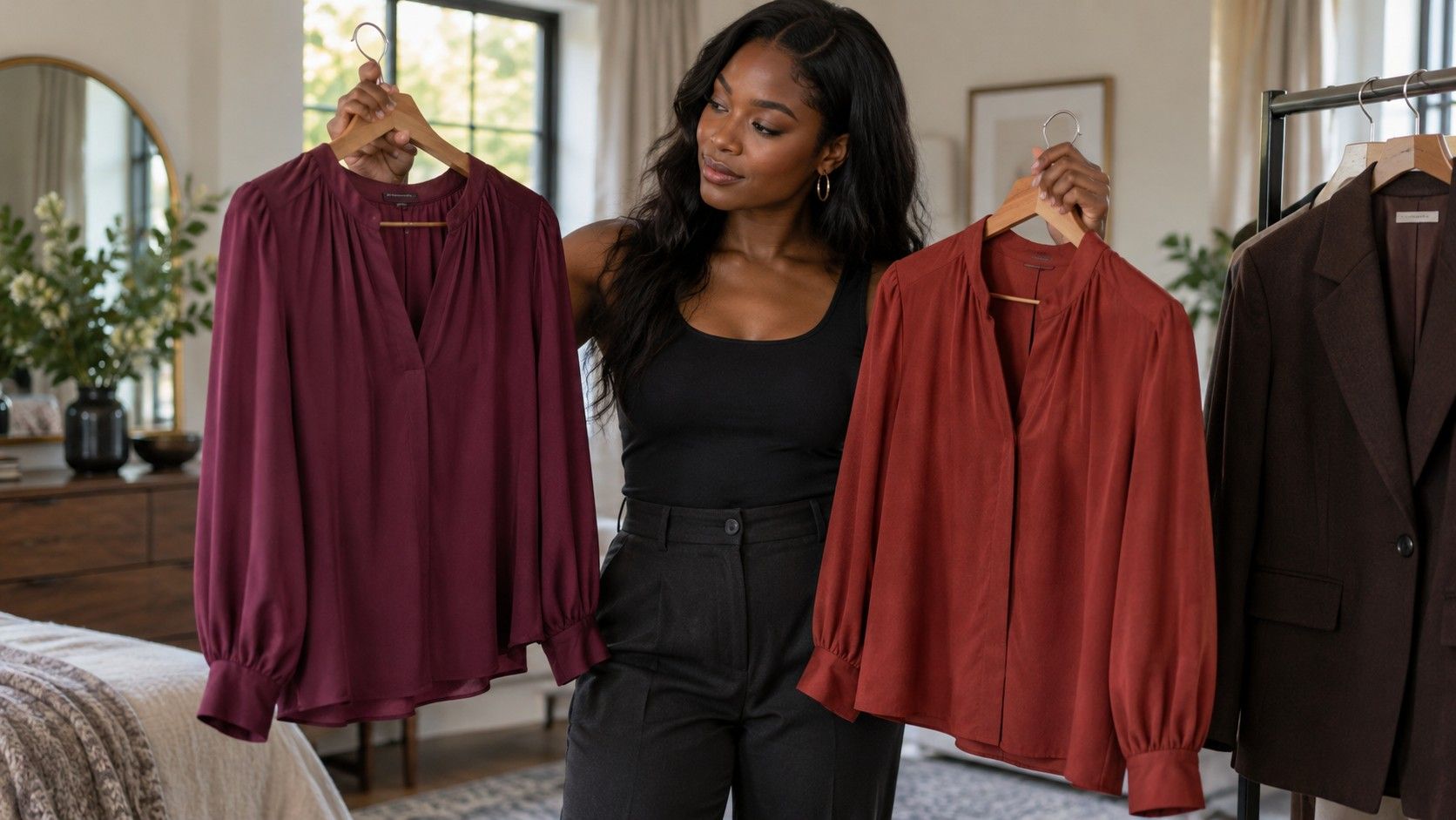
Deep Winter and Deep Autumn can look remarkably similar on a crowded clothes rail: dark greens, rich reds and substantial neutrals appear in both. The useful distinction is usually how those deep colors lean and how clear or softened they look. Rather than identifying yourself from hair and eye descriptions, compare a few fabrics while keeping their depth reasonably steady. Seasonal palettes are styling conventions with variations between systems. A comparison can help you choose a sweater or jacket without proving that you belong permanently inside one named category.
Keep depth steady before deciding which season fits
The shared word matters. Both a deep winter color palette and a deep autumn color palette emphasize darker values, although neither consists entirely of near-black shades. If you compare a pale peach blouse with a dark plum sweater, the difference in lightness may overwhelm the temperature question. Start with two garments that occupy a similar place between light and dark. Their fabrics and necklines should be reasonably similar too.
Use an item you already enjoy as your reference. A dark blue shirt, a chocolate knit or a burgundy scarf gives the test a familiar starting point. Bring it near your face in even daylight, then swap in another deep shade. Keep the background and position unchanged. Turning toward a warm lamp halfway through the comparison adds a new variable that can make the fabric appear to have done more than it has.
Depth does not mean that you must prefer the darkest possible option. A near-black shirt may feel too heavy while a slightly lighter, rich color works comfortably. Record that difference before choosing a season name. “Deep colors, with a little breathing room” can be a more useful shopping note than a label that tempts you to buy black in every fabric.
Do not infer a palette from complexion depth or ethnicity. People with different skin colors can prefer similar clothing palettes, and visible coloring alone does not settle a styling comparison. The question here is how you like the relationship between a fabric and your face. That is different from assigning a category because a chart shows a model who resembles you.
Compare a cool berry with a warm brick red
A deep berry and a deep brick red can make the temperature question easier to see than two nearly black neutrals. In common seasonal usage, a cooler berry leans toward blue or purple, while brick red leans toward orange or brown. Choose examples with comparable depth and saturation. A glossy bright berry lipstick and a faded brick sweatshirt are not a controlled pair, however clearly their names suggest the two seasons.
Hold each fabric at the same height below your chin. Give yourself a moment to look away between swaps so that you are not staring continuously at saturated red. Ask whether you prefer the warmer or cooler relationship and whether the difference repeats. Avoid turning every normal shadow into a verdict. A familiar phrase such as “this makes me look ill” often says less than a specific observation about the outfit’s balance.
If both reds work, compare a second pair in another family. A cooler deep green against a warmer olive can offer a fresh comparison, provided neither is much lighter or duller than the other. Color names are inconsistent across retailers, so inspect the actual cloth instead of trusting “forest,” “wine” or “rust” as precise specifications.
Make room for a mixed answer. You might prefer berry in a smooth blouse and brick in a textured cardigan. Texture, sheen and the amount of fabric visible all affect an outfit. That result does not require you to dismiss your eyes or repeat the experiment until one side wins. It may mean that both temperature directions are useful, with different styling around them.
Test dark neutrals where you actually wear them
Compare a cool-looking dark neutral and a warm-looking one beside your face. Common starting points include black or charcoal on one side and espresso or deep warm brown on the other. These are broad directions rather than official swatch matches. A brown can lean cool, and some charcoals have a noticeable colored cast. Place the garments together first so that you can see what you are comparing.
Judge a jacket as a jacket, with the shirt or knit you expect to wear beneath it. A dark outer layer frames more than your skin; it also frames the rest of the outfit. If an espresso coat looks good over cream but feels awkward over your usual cool grey, that is valuable wardrobe information. It does not demonstrate that brown itself is forbidden.
| Comparison | Keep reasonably similar | Useful question |
|---|---|---|
| Black and espresso | Neckline, visible area and fabric finish | Which integrates more easily with your face and usual layers? |
| Charcoal and deep warm brown | Approximate depth | Does a cooler or warmer neutral feel easier to repeat? |
| Dark navy and dark olive | Lightness and degree of softness | Which supports the colors you already wear? |
| One neutral worn alone and layered | The same garment and light | Does a different neckline color change your preference? |
Try the neutral across more than one outfit before making it your new foundation. A single striking combination can be fun without being versatile. For a work jacket, compatibility with several shirts may matter more than a subtle temperature preference. For a scarf, the color beside your face carries more weight because it is the visible purpose of the item.
Check brightness after the temperature comparison
Deep Winter is commonly presented with clearer, more vivid colors, while Deep Autumn is usually shown with a warmer, somewhat softened richness. The precise boundaries vary by system. Do not fold this difference into your first red comparison and assume that warmth explains everything. Once you have a tentative temperature preference, compare a clearer and a more softened version within that direction.
Chroma describes vividness or softness; value describes lightness or darkness. A dark color can still be vivid, and a muted color need not be pale. Put a clear deep green beside a smoky deep green to see the difference in actual cloth. If one is also much darker, acknowledge that you are comparing a package of qualities rather than isolating chroma.
Look at the amount of contrast in the finished outfit as well. A dark jacket over a very light shirt creates a strong value difference, even when both colors are muted. A deep tonal combination can feel quieter without changing temperature. If the high-contrast version feels too abrupt, first try a middle-value layer before rejecting every color associated with Winter.
There is no obligation to look equally formal or equally striking in every setting. A crisp black-and-light pairing may suit the impression you want at a presentation, while deep brown with olive feels right for a relaxed day. Your preferred effect is part of the decision. Seasonal analysis should supply vocabulary for those choices, rather than treating one style of presentation as objectively superior.
Buy one useful layer before replacing favorites
After the comparisons, write a narrow working rule. It could be “try cooler deep reds first” or “choose warm dark neutrals for knitwear.” Include the garment type if your preference depended on texture or placement. A rule tied to an actual need is easier to test than deciding that your entire wardrobe has been assigned to the wrong season.
Choose one layer that works with existing clothes. A scarf, shirt or cardigan can introduce the preferred direction without requiring new shoes, trousers and accessories. Check whether it makes at least a couple of outfits you would really wear. A beautiful swatch match that creates a chain of additional purchases is less practical than a slightly neighboring shade that fits the clothes you own.
Shopping photographs are imperfect color references. Screen settings, studio lighting and editing can alter the apparent warmth of a brown or the clarity of a berry red. Compare in person when possible, or use a seller’s actual return conditions if a home comparison matters to you. Keep labels and receipts until you have made the decision; do not assume every retailer allows the same kind of return.
Keep favorites that lie outside your tentative palette. A warmer bag can sit comfortably in a cooler outfit, and a shirt you love may work with a different layer near the face. You are allowed to wear a color simply because you enjoy it. Review the new piece after several ordinary wears: if it makes combinations easier, the comparison has been useful even if you never settle the Deep Winter versus Deep Autumn label.